
Redefining Working Class: Lives Less Ordinary
Four Artists' Work

I am back :) And ready to continue working on this series. After having a private tour (fancy, I know :)), I have come back with so many new ideas and thoughts about the exhibition that I don’t think I would have had previously. The exhibition is incredible and if you have not had the chance to visit it yet, please do! It is open till 20th April 2025.
I may have mentioned previously my inability to appreciate art previously however, now having a bit more understanding and placing context with the artwork, has helped me to appreciate the art, the artist and the surroundings further.
Lives Less Ordinary is no different. Having layers of personal experience, the understanding of the context, the opportunity to speak/hear/ listen to the artists behind the creation and then the curator on the reasons for the pieces being placed together has helped to bring more meaning to the otherwise mismatched pieces of artwork together.
As I mentioned in my last two posts, working-class individuals have been misrepresented in all forms of media, and art no less. Many times, it seems as if it has been censored to continue to project this negative image of what it means to be working class. So, for today’s post, I want to focus on some of the artwork that spoke to me as we walked around the exhibition and discussed interpretations and the meaning that it brought to me.
Before I jump into the different artists and their work, I wanted to point out an observation a friend and I made as we walked around the exhibition. We discussed space in the photographed work and the paintings. Working classness is somewhat paralleled with clutter and maximalising, which automatically recalls mess. Even the use of the word clutter in my own explanation only goes to prove this association we have internalised about what it is to be in a working-class household or environment. However, there is much more to this than what meets the eye. It seems as if this idea of maximalism is somewhat a comfort. The idea of hoarding and keeping items due to the pride of having these items or appreciating and displaying their form of wealth to be able to bring comfort and escape their realities somehow may be reasons for this décor style. However, it seemed to be the one thing common. You will see this in the first piece I discuss as well as the final piece of artwork. However, I also noticed that there were two other artists (body of works discussed in the middle) where they used minimalism in their images, whether that was backdrops that they designed, or it was using the natural spaces to do so.
Baa’s House, Hetain Patel
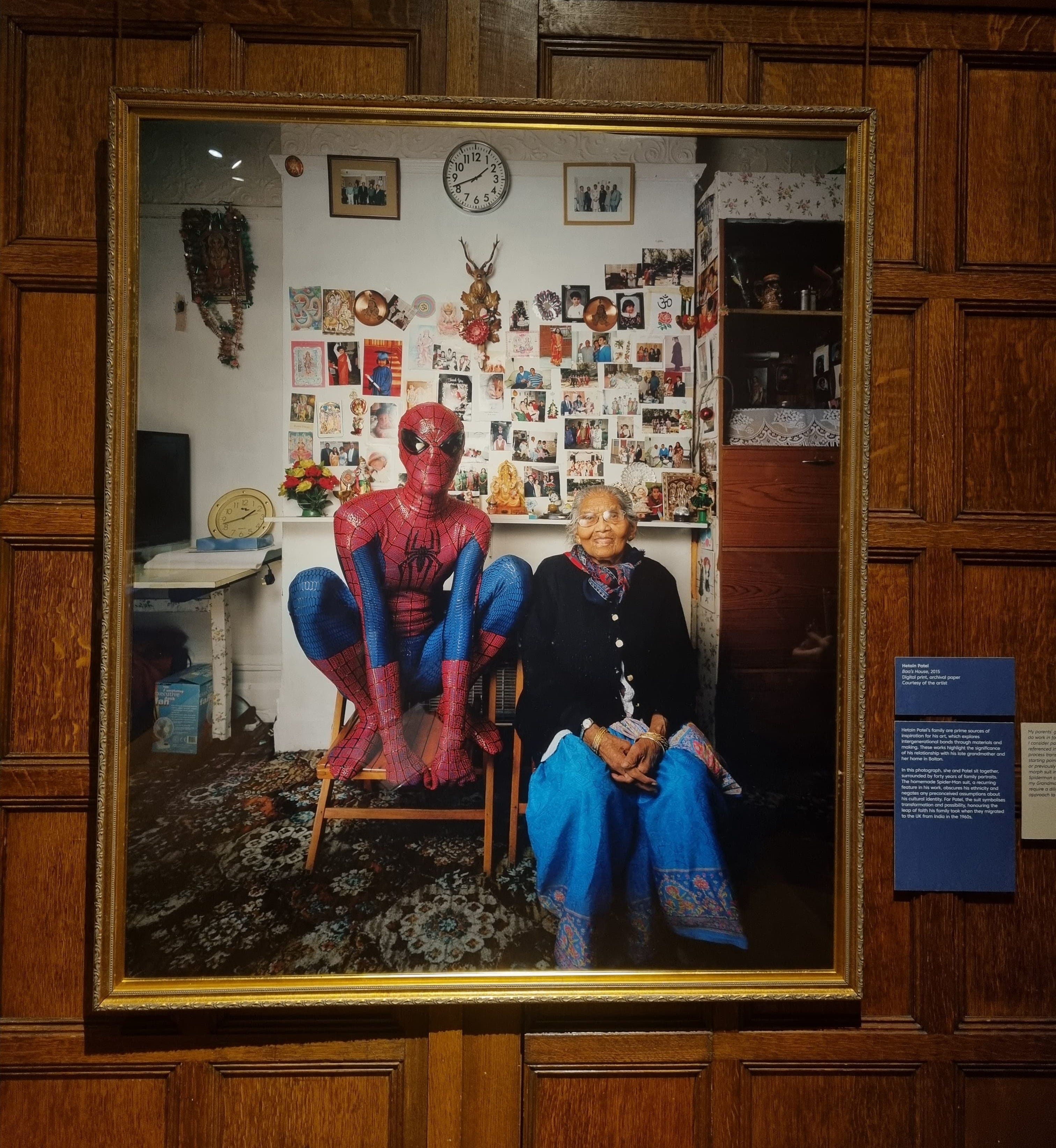
As soon as we entered the space, this artwork was the one I was looking for. It was massive, yet it captured what I can only imagine to be such a special moment. My connection to the piece was immediate—not just because of its scale, but because it evoked something deeply personal. As I’ve mentioned before, my grandma was incredibly special to me, and I also called her Baa. This added another layer of meaning to the artwork, transporting me back to moments spent at my Baa’s house.
The story this piece tells is one many of us can relate to. In close-knit families, we gather in one place, reconnecting regardless of the occasion. There is a safe space for all of us, and it was the same for Patel. This section of the exhibition highlights connection and togetherness—essential themes in discussions about working-class identity. Too often, the state and media portray working-class communities through a lens of division, pitting us against one another. Yet, in reality, our experiences are so similar that many of us found ourselves picking apart the details of the artwork and reflecting on its familiarity. And perhaps that’s the exhibition’s true purpose—to foster a sense of belonging, to make people feel less alone, and to break the stigma surrounding these shared experiences.
Beyond togetherness, the piece also speaks powerfully about identity. The collage of images behind Baa and Patel features two striking symbols: the ‘aum’ and the ‘English Rose.’ Their coexistence within the same space speaks volumes about the blending of identities across generations. The merging of cultures is reflected not only in these symbols but also in the attire of the figures in the artwork. They represent the balance between heritage and adaptation, directly challenging the media’s false narrative that immigrants struggle—or refuse—to assimilate into British culture.
Another subtle yet powerful element in the artwork is the representation of wealth and power, particularly in the hands of women. Baa is adorned with gold bangles, which in many cultures are passed down or gifted, symbolizing unity and strength. This detail hints at the often-overlooked role of women in carrying families, preserving traditions, and maintaining a hidden economy that, while undervalued by many, holds immense significance. The way women bring people together, serve as the backbone of their households, and uphold generational wealth—both material and emotional—is a theme that resonates deeply.
You Get Me, Mahtab Hussain
We also had the incredible opportunity to hear from Hussain himself, gaining insight into his inspirations, intentions, and the evolution of his work. His series focuses on working-class Asian boys and men, exploring how they navigate their identities despite being ostracized and villainized by the media—especially in the past two decades.
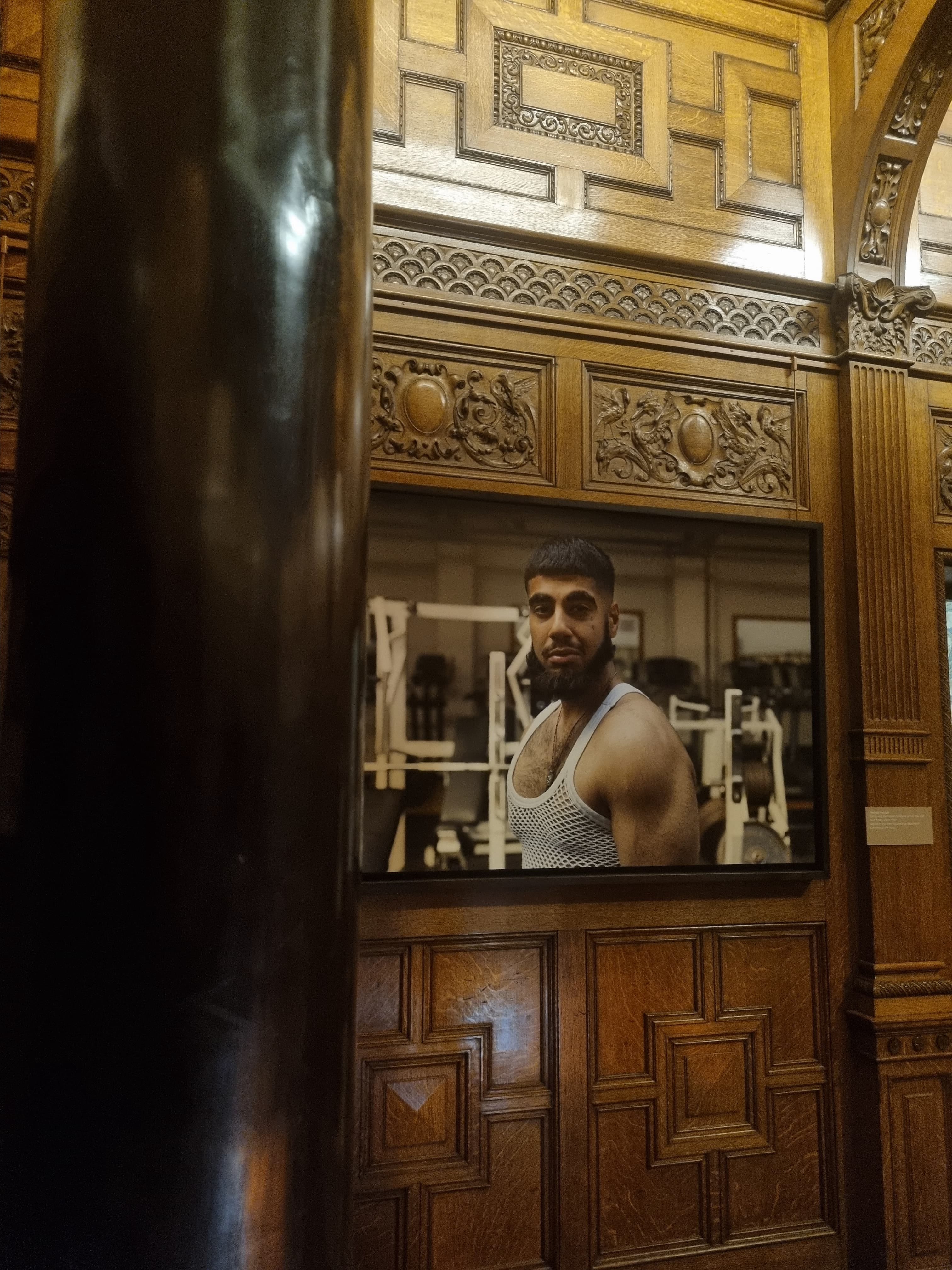
Mahtab captures this struggle in his images by portraying these so-called ‘tough-looking’ men with a specific focus on their eyes—windows to a deeper innocence often overlooked by society. The choice of print further emphasizes these themes. Hussain prints images of older men on aluminium, leaving them exposed and unprotected—symbolic of the resilience they have had to build against the world’s harsh realities. In contrast, portraits of younger boys are framed behind glass, representing their innocence but also their fragility. The glass, though protective, is breakable signifying how easily their perception of the world and their sense of security can shatter, leaving them vulnerable to the same struggles as the older generation.
Under The Hood, Chris Harrison
Harrison’s work is just as compelling in its simplicity yet deeply thought-provoking. Once again, the setting in which these images were taken plays a crucial role in shaping the emotions they evoke. The rich, velvet red curtains in the background contrast sharply with how working-class individuals are typically perceived. Their grandeur carries an almost royal quality, challenging preconceived notions and reinforcing the idea that these identities belong together rather than being divided. The consistent use of red in both the backdrop and the foreground visually ties these elements, further emphasizing unity.
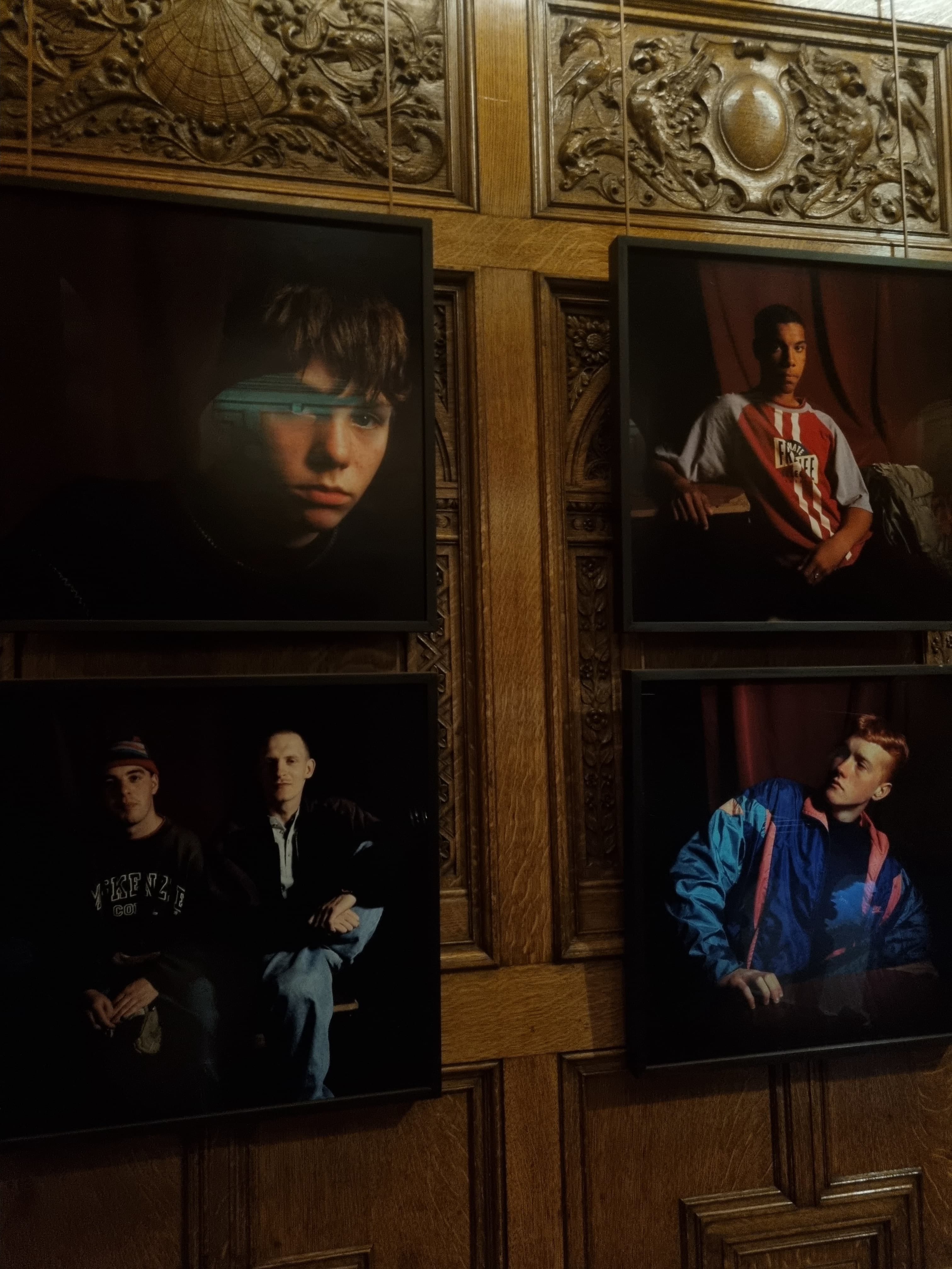
By offering his subjects a platform and inviting them to be photographed in such an opulent manner, Harrison resists traditional artistic structures and disrupts the rigid ways in which working-class individuals are often represented.
The positioning of the subjects also plays a key role. Some frames feature individuals standing alone, while others capture them in groups. This contrast highlights the shifting perceptions of working-class individuals—depicting both the vulnerability of the lone figure and the perceived ‘threat’ of togetherness. The careful composition of each frame underscores the significance of how we view and interpret these individuals, reinforcing the broader themes of representation and identity.
This England, Bob Robinson
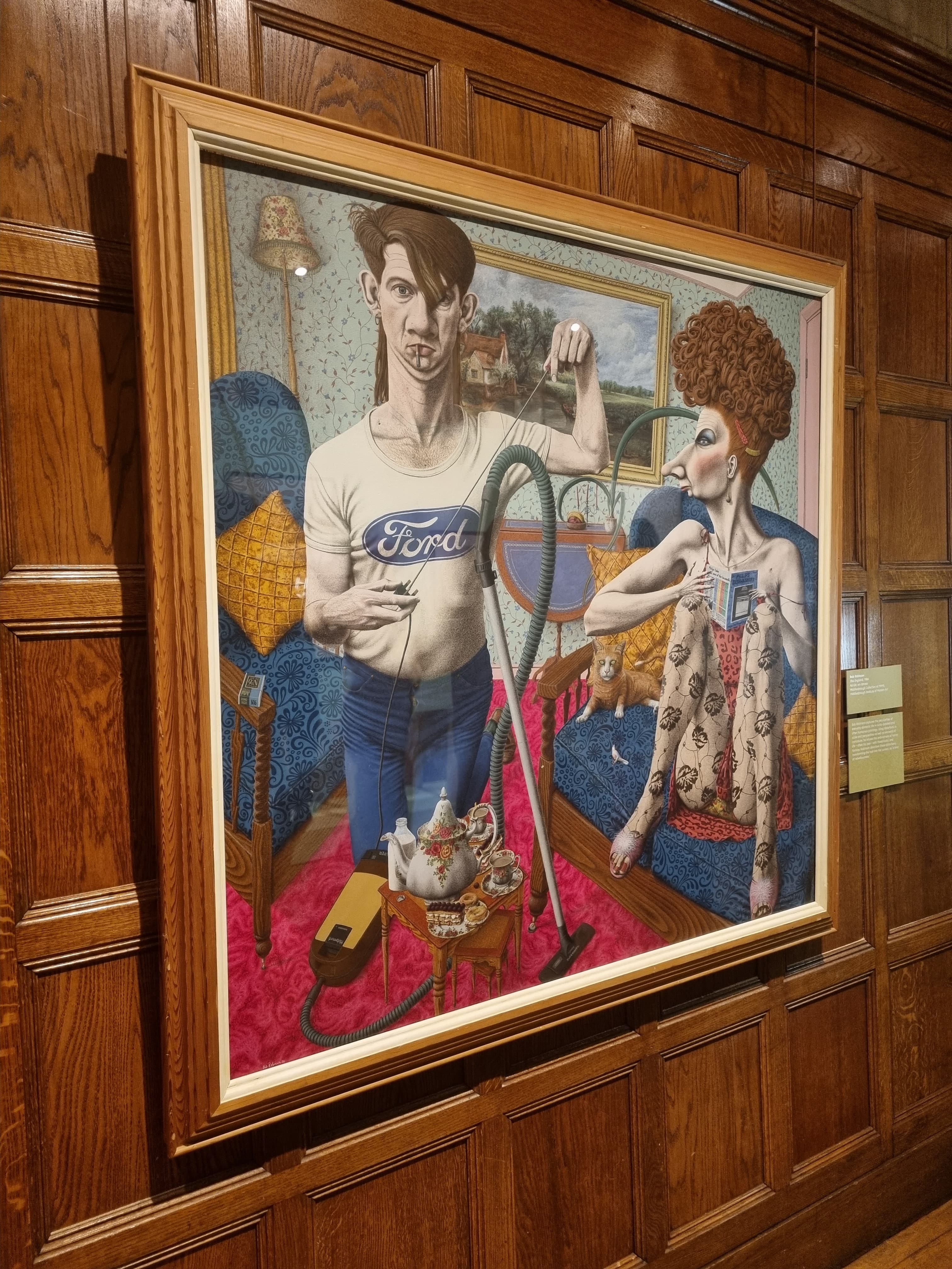
Robinson’s work, in contrast, immediately evoked an instinctual reaction—a laugh—due to the exaggerated, disfigured characters depicted. His intentionally distorted figures serve to highlight the alienation of the working class, mirroring the ways in which they are often misrepresented in society. The artwork functions as a microcosm of reality, reflecting the absurdity and disconnect that exist in mainstream portrayals of working-class life.
The use of bold, contrasting colours further amplifies this sense of unfamiliarity, drawing viewers in and creating a deliberate sense of unease. The inclusion of a branded t-shirt subtly critiques capitalism, where brand visibility equates to power and wealth. Another striking feature is the deliberate mismatch of proportions and spatial awareness. The couple and their home seem almost alien, despite the presence of familiar objects. The figures themselves, however, feel entirely out of place, reinforcing the overarching theme of displacement.
Robinson’s work invites viewers to deconstruct these elements, prompting reflection on whether this sense of misplacement is intentional or a natural consequence of societal structures. This complexity is what makes the piece so captivating—it demands attention, pushing us to question the ways in which working-class individuals are positioned within broader cultural narratives.